The situation
The most interesting content problems at Strike were routing problems, and underlying those was ultimately an education problem.
When a customer starts an on-chain withdrawal, they would see a network fee. When they try again the following week, the fee is different, because the mempool is congested. Nothing in the interface explains bitcoin market fee dynamics, so from their side it may look like arbitrary pricing by a company holding their money.
For a bitcoin company that is not only a UX gap, but a knowledge gap. Growth comes from people who are new to bitcoin, and a newcomer has no model for block space, for mempool congestion, or for why an on-chain fee and a Lightning routing fee behave differently. Power users already understand those things, but the customers the company needs next do not, and no tooltip is going to teach them adequately.
Every available answer in the UI is inadequate. The interface has no room for the explanation, and once users understand the concept they do not need reminders. Additionally, a help centre article is not something users tend to abandon a withdrawal flow to search for. While Customer Support can absorb the user confusion, at a recurring cost, that would come after the customer is already annoyed. Saying nothing means accepting the abandoned transactions.
A single question needs answers at several depths, presented only when needed, and with the customer choosing how deep to go.
The strategy
I wrote every entry in the help centre, all the words in the UI, and every article in the Learn library, which meant I could design the layers instead of filling in someone else’s. This meant roughly 120 help centre entries and an education library covering bitcoin, Lightning, money, markets, custody and how-to, and all of it again in Spanish. AI-assistance is what made that volume possible, while judgement about what belonged at which layer is what made it work.
The second part of the strategy was feedback loops. I held regular meetings with the customer support team and messaged the reps directly after every launch, because they know within days where a product is confusing and nobody else finds out for a month. I also had direct access to the support macros and visibility into ticket data, so I could see which automated responses were firing most often and which questions kept returning. A support macro firing hundreds of times is a content defect wearing a support cost, and the fix usually belonged upstream in the UI copy or the FAQ, not in a better macro. That loop is how the layers below got placed where they did.
Selected work
Layer 1. In-flow tooltip. One sentence at the point of friction, covering what an on-chain withdrawal is and why a fee applies.
Layer 2. Help centre entry, surfaced in-app. Who the fee is paid to, why it varies, and what the customer can control, reachable without leaving the app.
Layer 3. Learn article. The long version, covering the fee market, limited block space, sats per virtual byte, and five ways to pay less.
Layer 4. Cross-links. The fees article and FAQs route onward to Lightning, UTXOs, and on-chain versus Lightning.
Language routing. The app’s language setting decides which version the deep link resolves to, so a Spanish-language customer lands on the Spanish article.
Four content layers made any trivial in-app transaction into something that could be thoroughly understood by any user. The language routing was the part that required extra scoping, and it went in because Spanish-speaking customers were otherwise being handed an English article at the moment they were already confused.
The cumulative volume that determines a trade’s fee already includes the trade itself. This way, a single trade can be large enough to land in a better tier on its own, and when it reaches or crosses a threshold, the lower rate applies to the entire trade, not just the portion above it.
You start each month at the tier you ended last month in, so progress isn’t lost: you keep growing toward the next tier rather than starting from scratch.
For example, a single $5,000 buy in January would qualify for the $5,000–$50,000 tier at 0.79%, costing you $39.50. Five separate $1,000 buys would run trades 1–4 at 0.89% and the 5th at the next tier’s 0.79%, for a total of $43.50.
The clause “so progress isn’t lost” came from support. Customers were not asking how tiers worked, they were asking whether their volume reset, and the anxiety was about losing something they had earned, not about the pricing. Answering the mechanic without answering the fear would have left the ticket in place.
The worked example runs two paths to the same volume because the reps kept getting a follow-up question the first version invited: whether it was better to trade in one block or several. Showing both totals ends the conversation.
When you place a target buy order, the required cash is deducted from your balance or initiated as a deposit from your linked payment method and held in reserve until the order executes or expires.
When a target order is removed, the reserved funds will be released back to your balance. Please note, orders only execute in full, not partially.
This paragraph exists because of a support pattern. Customers placed a target order, saw their available balance drop, and contacted support believing the money was gone or the order had been placed. The product was working correctly and the copy had not told them what to expect.
The fix was to specify the deposit mechanics at the moment of placement, say plainly where the money went, and then say when it comes back. “Orders only execute in full, not partially” was another part of the feedback loop and it got added to the same entry instead of a new one.
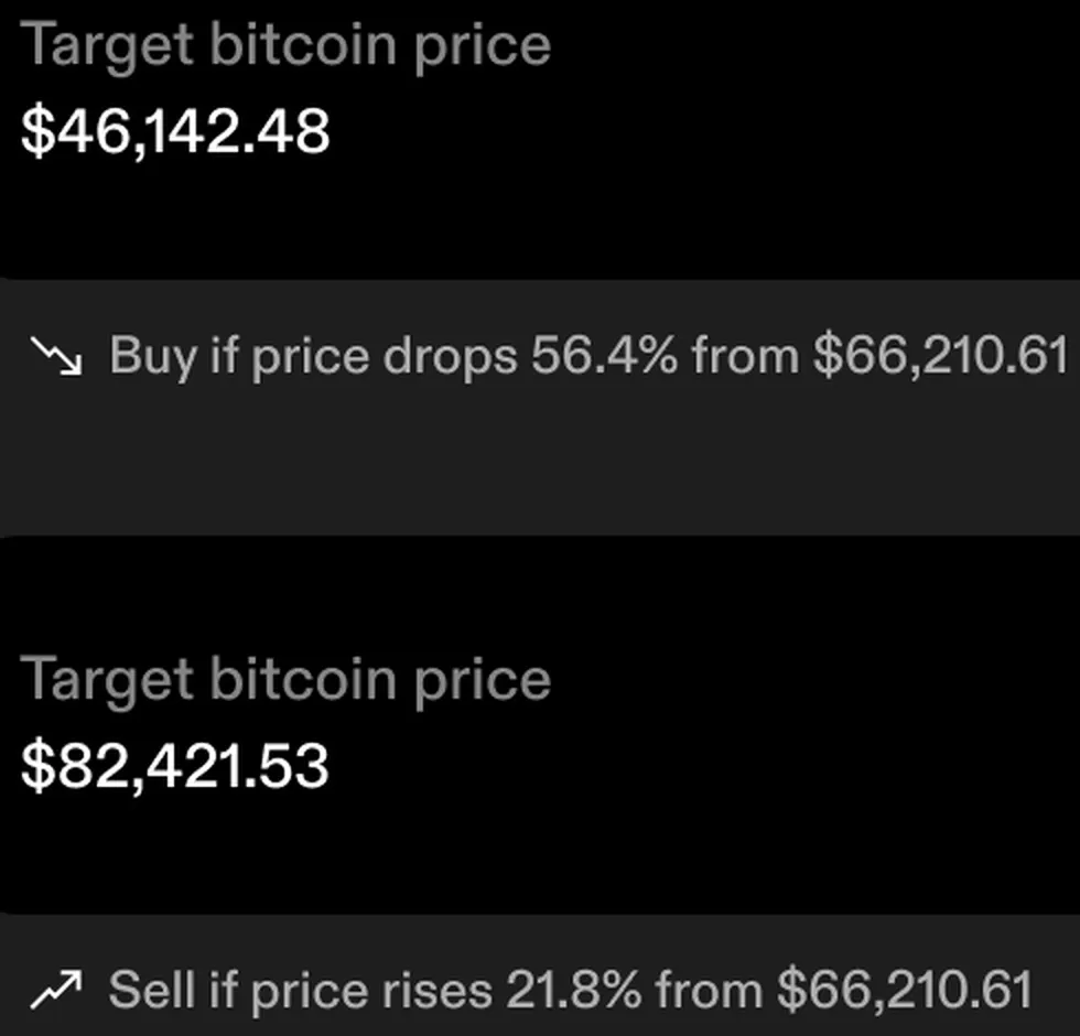
The line under the field restates what the customer just typed as the thing they meant. They entered a price, but what they were deciding was how far the market has to move, and in which direction, before their money is committed.
Initial designs were unclear whether the targets were on the wrong side of the current price. The percentage and the direction are computed live so that mistake becomes visible while the keyboard is still open, which is cheaper than a cancelled order or a customer support ticket.
The KYC flow was the highest-stakes copy in the product, because a customer who abandons identity verification never becomes a customer at all. Working with product and design, the flow went from around fifteen screens to nine, and drop-off fell by more than 5%. The copy on the surviving screens was rewritten at least a dozen times to find the optimal solution.
Each pass sought to optimize across the same two things: how fast someone could get through, and how complete their submission was to avoid unnecessary reviews or delays and put them in a support queue.
Twelve rewrite iterations sounds excessive until you look at the ultimate purpose. Shortening the copy sped people up and increased failed submissions, because customers stopped reading the document requirements, while lengthening it did the opposite. The version that was ultimately implemented was the one where both curves were acceptable, and finding the balance needed the failure data from support.
Outcome
A content system spanning every surface the customer touches, built and maintained by one person over three years:
- More than 50 Learn articles, covering bitcoin, Lightning, money, markets, custody, and how-to.
- 120+ help centre entries, and all of it repeated in Spanish.
- Dozens of in-product tooltips and copy footers, each mapped to the entry or article that provides the explanation the customer is looking for, with the deep link resolving to their app language.
- A standing feedback loop with customer support and with management.
- A KYC flow rebuilt against abandonment, from around fifteen screens to nine, with drop-off down more than 5%.
The Strike iOS app holds a 4.8 rating across roughly 28,000 App Store ratings, and reviewers consistently describe it as clean, minimal and beginner-friendly. That rating belongs to the whole product and to the design team as much as anyone. My contribution was all the in-product copy, and for three years every word of it was mine.
Source: Strike on the App Store, checked August 2026.
Written as Senior Content Manager at Strike, 2022 to 2025. The Learn library, the help centre, in-app copy, support macros, notifications and translations were mine during my tenure.